They are not easy to spot with the naked eye but with a loupe you should be able to tell them apart from the real Sonnets. Here is a list of what to look for:
Lets start with the nib. The unmistakable test on a fake 18K marked nib is this one. What do you think? ;)
Here is a steel one. At the top (REAL) clear lettering and symmetry in the cut. At the bottom .. hmm, the opposite lettering is faint and the cut way offset (FAKE) This should be easy to recognize by everyone.
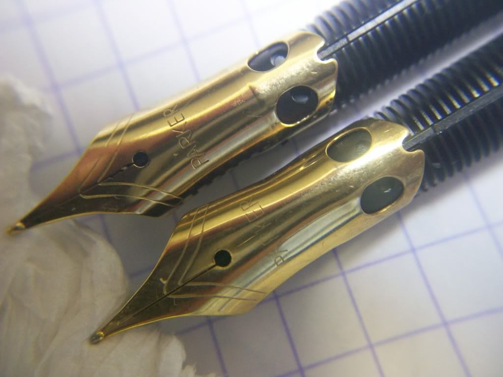
On the feed where the size of the tip is marked. The real one has a clear mark of F (REAL) which the FAKE has a mark that looks like a hot iron burn on a cow :)

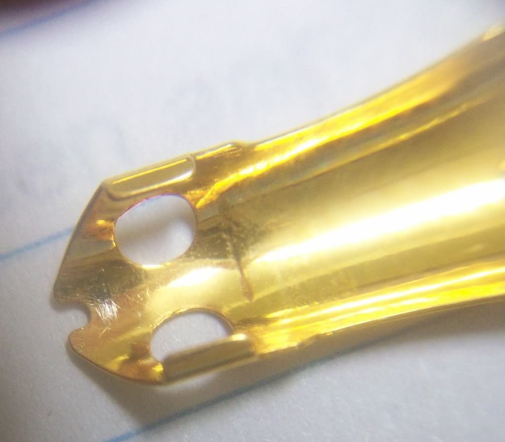
Marks on the nib (18K 3rd generation nib)
REAL: Sharp grid with clear shape - indicates good tools with precise tolerance and good wear resistance.

FAKE: Rough grid - bad tools (or improperly hardened tools). Note also the pure plating (this was supposed to be a two-tone nib.

Similar differences in the other marks on the nib. In each set - the first is the OK one and the second is the fake one.
REAL

FAKE
REAL
FAKE

Another obvious difference. The FAKE (bottom) has a huge gap between nib and feed (not always) and it has the remains of an injection molding gate at the tip. The REAL (top) is nice and snag.

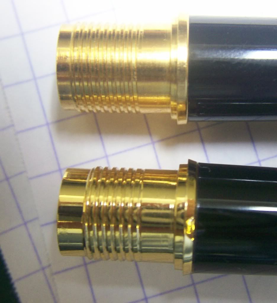
At the section ring, the fakes (right) usually have an ugly gap between the section ring and the main part of the section.

The bottom face of the section provides more clues. The REAL (left) is smooth and clean. The FAKE (right) has filling signs on it and excess plastic from injection molding. Look also at the machining marks on the face of the section ring in the FAKE (right)

 REAL
REAL FAKE
FAKEThe fit between the plastic part of the section and the metallic part of the section threads is a major tell-tell. Bad fit and signs of glue (do you see the two blobs of glue ...) - mean it is FAKE.
NOTE: The shinier is the FAKE here !!!!
The barrels are difficult to distinguish externally. Inside they are very different. FAKE on the left - REAL on the RIGHT :)

Cap jewels. Look for signs of misalignment in the fakes. Here the difference is clear. FAKE on the left - REAL on the RIGHT. A more suttle difference is in the metallic part under the jewel. In the REAL pen, it is nicely machined with round fillets and clean lines. Not in the FAKE.

Cap ring.
REAL: Nice and clean joint line

FAKE: Note the roughness of the ring and the poor surface quality.

Note the difference in the clarity of the feathers and the gap under the clip.
Another common tell-tell sign of the fakes.
REAL: Clean and strong feathers.

FAKE: Weak Feathers

Similarly under the microscope.
REAL:

FAKE:

I hope this is helpful. Don't hesitate to send me samples to evaluate.
PS1> In an earlier version of this post I wrote:
REAL: A round hard tip material was ground on the top (non-writing side) to shape and a round mark remains (M nib).
FAKE: A round ball with no grinding sings is present indicating that this is most probably a steel ball rather that a hard material than needs to be shaped by grinding.
This is NOT correct. The majority of the true Sonnet nibs dont have grinding marks.
A detailed comparison of nibs is coming up soon.
PS2> The high mag photos were taken by a QX5 Digital Blue toy Microscope ($70)


4 comments:
Thanks. Very helpful.
thanks very helpful
gr8 comparison. THNX
Thanks. You've set my mind at rest on a pen I just bought unused, second hand today.
Post a Comment