Table of Contents
1. What is flex?
1.1 Grades of flex
1.2 Thin/thick contrast and tine opening
1.3 Behind a beautiful flex nib there is a capable feed
1.4 Materials for Flex
2. Practical advice for writing with flex nibs
2.1
3. Links to samples and other resources
1. WHAT IS FLEX?
Flexible nibs produce variation in line thickness by applying high pressure on downstrokes and no to low pressure on upstrokes.
A flex nib is good when it:
1) allows for comfortable execution and
2) results in pleasing writing.
1.1 Grades of flex
The terms soft, semiflex, full flex and wet noodle are often used in reference to flex. In general, I prefer the following definitions:
- Rigid ("nail"): If you press more than normal on the paper, it will drill a hole.
- Soft: The pen feels like a spring. It “gives” under pressure. The line may or may not get wider under pressure but the line variation is not "significant" under "normal" force.
- Semiflex: A nib that is non only springy but it creates a "clearly" wider line when pressed during the downstrokes. Flexing requires "some" force to be applied. There will be several people who may not be comfortable to flex on every downstroke, but occasional flourishes should not cramp your hand.
- Full flex: A nib that flexes easily enough to allow significant line variation on every letter.
- Superflex a.k.a wet noodle: A nib that flexes easily and to a considerably large opening under a low force. A characteristic of the wet noodle is in the lifting of the pen after flexing. In a semiflex or flex nib the pen bounces right back once the force is released. In the case of the superflex I almost feel that I have to consciously lift the pen. Then may lead to loss of rhythm if the writer does not have a good hand control.
There is no strict demarkation between the various grades. These are not discete values. Not only this but these terms are relative. First, they depend on the individual strength of each writer (what is flex for me maybe semiflex for someone else). To make things a bit more complicated, these terms are used by the average user in a way that reflects their own experience. For example, a user, who has only tried modern flex, will not be able to appreciate that many vintage pens are much more flexible than most modern and will most often overestimate the flexibility of a nib.
The flexibility of a nib must be matched against the writing force and the dextrity of the writer. For this reason, the best way of selecting a flexible nib is to try it in person. If you don't do this, chances are that you will need to go through several pens in order to get to one that is best for you.
1.2 Thin/Thick contrast and tine opening
You may have noticed that I did not employ the opening of the tines in my discussion of flex grades. I did this for a specific reason. Although we often get excited with very large, maximum tine opening, it may not be useful. A wet noodle with large maximum tine opening is useless if your letters are small. Good flex to me is the one that produces a pleasent result. The secret to a pleasing result is:
- good thin line/thick line contrast
- proper proportionality between thick line and letter size
It does not make sense to use exact ratios as a variety of ratios produce pleasing results. So take the following suggestions with a grain of salt. I like a ratio of thick to thin line that is more than 3. I like the thick lines to be about 1/5 of the height of small letters. If they are larger the letters appear chubby.
Therefore one needs to match the opening of the tines to the size of the writing. A ultra super-duper wet noodle pen is useless to someone who writes with small letters. Also such a pen does not allow quick and precise control over short strokes. As a result, it requires very high attention to perform well even if the user has high levers of dextrity. In these cases a semiflex nib might be better. 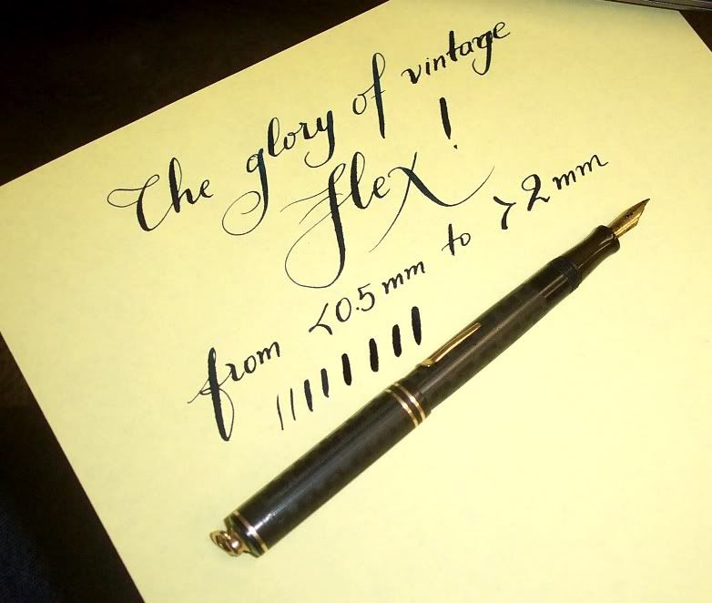
1.3 Behind a beautiful flex nib there is a capable feed
Flex nib require highly variable and rapidly changing ink flow. A good flex nib should have:
- sufficient flow to allow the formation of fat lines
- rapid reduction of the flow when switching from thick to thin lines (like in letters u, n, m, etc.)
The key to the reputation of vintage nibs as "best" flexers is usually the fact that they are very wet when flexed. Modern pens have feed that limit too much flow and as a result they starve the nib when they are flexed, i.e. the ink film breaks and instead of a fat line we get two fine lines, one from each tine. There is nothing worse than a nib that is capable of large opening but the feed can not supply ink to it.
On the other hand the ability of the feed/nib to regulate the flow in rapid changes from thick to thin lines (like point C in the image below) is of paramount important for a beautiful result. There are 3 factors that play a role in all these: (a) the feed, (b) the fitting of the nib onto the feed, and (c) the spacing of the tines (I need to talk more about this - touching tines are good only in flex nibs :))

1.4 Materials for Flex
Before the discussion takes (as usual) a philosophical turn, let me preface it by saying that you can make a flex nib from any material... Turkey feathers have been used for centuries Inexpensive flex dip nibs are still made of steel but they corrode easily.
Stainless alloys have been used for a long time. Look at this gorgeous flexing steel nib (posted by Phthalo on FPN)
Long time ago I posted this article on Pentrace where I presented some comparisions of different materials with respect to flex. But the comparison is based on the specific criteria. For example when a nibmeister is asked to modify a nib, they prefer 14K than 18K because in general the 14K is stronger than 18K and allows for more drastic modification. remember that flex nibs are a disaster in the making according to Richard Binder. Especially the "flexier" ones are prone to damage (permenant deformation of the tines, unacceptable tine opening, cracks at the breather hole etc.).
The moral of the story is that flex can be found in any material, 14K, 18K gold, titanium, steel, etc. Try the pen and decide for yourself.
Under construction :)
2.1 Hand and pen position for writing with flex nibs
2.2 ....
3. LINKS TO WRITING SAMPLES AND OTHER SOURCES
Under construction :)
Test driving a wet noodle.

1 comment:
Great Article . I'm really into fountain pens now and I am slowly progressing towards a flex fountain pen though I have used dip nibs . Fountain Pen has great consistency..
Post a Comment